Checkout UX That Actually Converts for Small E‑Commerce Stores
Practical checkout optimization tactics for small e‑commerce sites: reduce friction, build trust, offer native payment options, clarify delivery, and nail mobile UX.

In every DigiForge build we've done for small e‑commerce stores, one truth surfaces fast: a better checkout is the highest-leverage change you can make. You can perfect your product pages, run flawless ads, and craft stunning emails — but if the checkout leaks visitors, none of it matters. Cart abandonment is a persistent challenge, and for small stores, every conversion counts. After years of building and optimizing custom Shopify themes, WooCommerce plugins, and headless commerce setups, we’ve distilled what *actually* moves the needle.
1. Reduce Friction Without Sacrificing Security
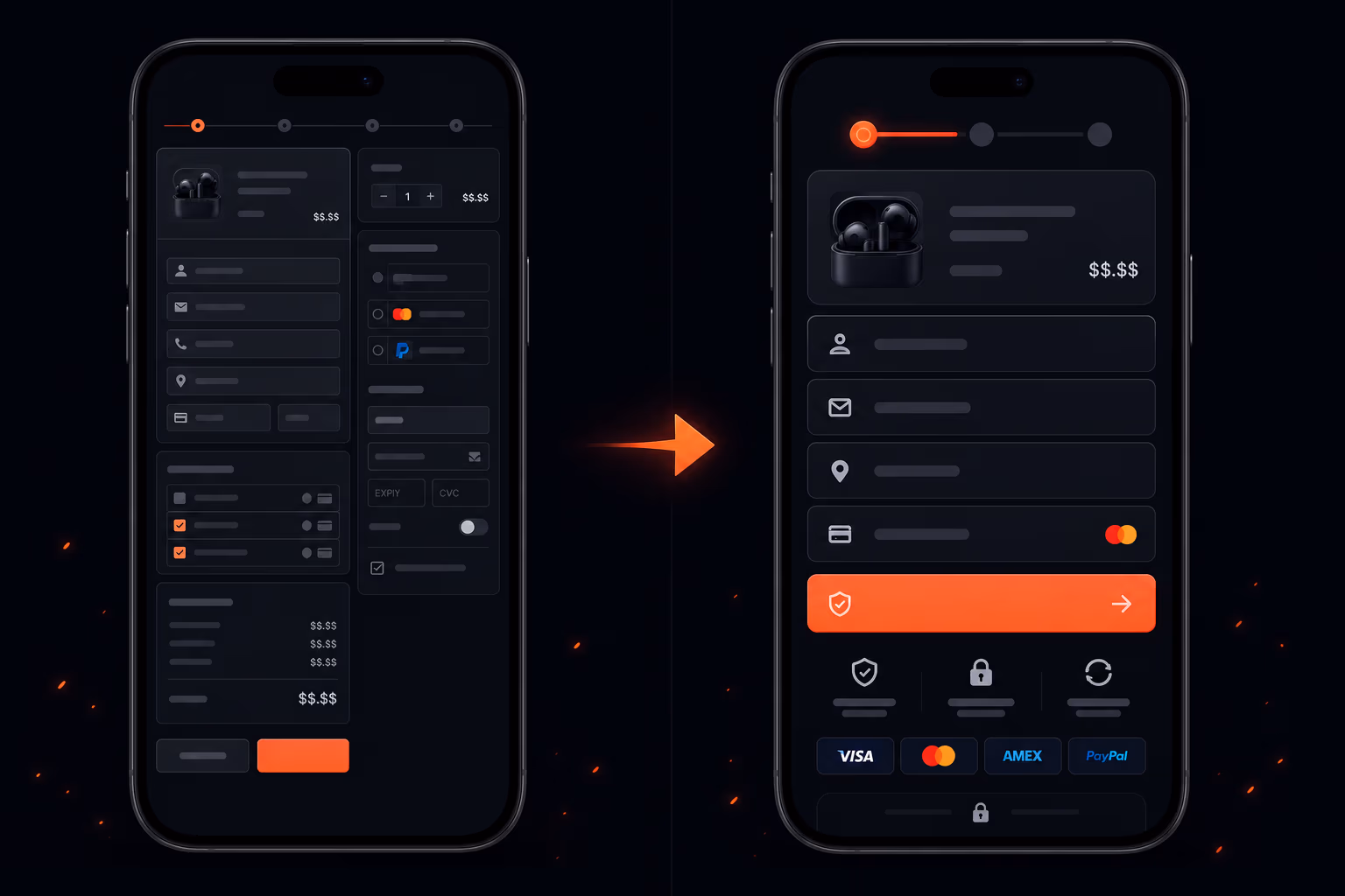
The biggest culprit in abandonment is a long, complicated checkout form. We've seen stores ask for a 'company name' field when they sell nothing B2B. Remove it. Every extra field is a reason to leave.
- Limit fields to essentials: email, shipping address, payment info.
- Use inline validation — show errors immediately, not after submit.
- Provide a progress indicator for multi-step checkouts (guest or account).
- Offer a 'guest checkout' option upfront. Forcing account creation is a top frustration.
We also lean heavily on autocomplete APIs for address fields. A user types three characters and their address appears. Saves seconds, reduces typos, and speeds the whole flow. Free services like Google Places are fine; for higher volume, we implement a paid provider with better accuracy.
Pro tip: If your tech stack allows, store the shipping address temporarily in localStorage so returning users don't re-enter it. Use a hash, not plain text, for privacy.
But friction isn't just about number of fields. Payment security is a friction point — too much or too little. We place security badges (SSL, McAfee, or a simple padlock) near the payment section. And we *never* ask for the CVV code if we already have a saved card with a confirmation — though this is rare for small stores. Better to show a brief reassuring message: 'Your information is encrypted.'
2. Build Trust at Every Step
Small stores lack the brand recognition of Amazon. You have to earn trust in 30 seconds. We've found three trust signals that work best:
- Visible contact information. A phone number or live chat icon on the checkout page. Even just an email address with a photo of a real person helps. We've seen a noticeable lift when adding a 'Call us' button next to the submit order button.
- Return and refund policy. Show a short link saying 'Free returns within 30 days' near the total. We usually place it under the order summary. Don't make them hunt for it.
- Social proof snippets. Real-time notifications like 'John from Ohio just bought this' are controversial (some find them spammy), but a single star rating and review count for the product in the checkout sidebar often boosts confidence.
At DigiForge, we also push for a consistent design language: the checkout page should look like it belongs to the store, not a third-party popup. Mismatched fonts or colors immediately raise suspicion. Keep the header logo, use the same accent color, and avoid unnecessary redirects.
3. Offer the Payment Methods Your Customers Actually Use
This is where a lot of small stores drop the ball. They accept only credit cards and PayPal. Meanwhile, a growing number of shoppers want digital wallets — Apple Pay, Google Pay, or local alternatives like iDEAL (Netherlands) or Boleto (Brazil).
- Add Apple Pay and Google Pay. They reduce form-filling drastically and work on mobile.
- For B2B or higher-ticket items, include 'Pay by Invoice' or 'Klarna' if margins allow.
- Consider a 'buy now, pay later' option (Afterpay, Klarna) — it can lift average order value.
We once migrated a store from a basic WooCommerce to a headless setup with Stripe Elements and saw a substantial increase in completed checkouts just by enabling Apple Pay. The catch: you need an SSL certificate (non‑negotiable) and a payment provider that supports dynamic payment methods. Stripe and Braintree are our go-tos for this.
// Example: Stripe Elements with Apple Pay
const stripe = Stripe('pk_test_...');
const elements = stripe.elements();
const card = elements.create('card');
card.mount('#card-element');
// Check if Apple Pay is available
if (stripe.canUsePaymentRequest()) {
  const paymentRequest = stripe.paymentRequest({
    country: 'US',
    currency: 'usd',
    total: { label: 'Total', amount: 1999 },
  });
  const prButton = elements.create('paymentRequestButton', { paymentRequest });
  prButton.mount('#payment-request-button');
}
If your store runs on Shopify or BigCommerce, many of these options are plug‑and‑play. For custom solutions, we recommend Stripe — it's developer-friendly and supports over 40 payment methods.
4. Be Brutally Clear About Delivery
Surprise costs — especially shipping and taxes — are the number one reason people abandon carts. We solve this by showing the total as early as possible, ideally on the product page or in a sticky cart bar.
- Show a shipping estimator on the cart page, not just at checkout.
- If you offer free shipping, highlight it with a progress bar ('Only a small amount away from free shipping').
- Display delivery timeframes in bold: 'Arrives by Dec 20' with a date rather than '5–7 business days'.
We also recommend adding a small 'Shipping Policy' link in the checkout sidebar. It gives anxious buyers a quick escape hatch to confirm without leaving the flow. And for international stores, always show the currency and estimated duty at checkout — not after.
5. Optimize for Mobile — Because Mobile Matters
A large portion of e‑commerce traffic now comes from mobile, yet mobile conversion rates often lag behind desktop. The main culprit? Poor typing experience. We address this with:
- Large touch targets. Buttons at least 44×44 pixels, inputs with enough padding.
- Auto‑detect input types. Use
type="tel"for phone,type="email"for email,autocompleteattributes so the browser fills in saved info. - Avoid zooming. If a user taps a field, the viewport shouldn't jump — test with real devices.
- Single‑column layout. Multi‑column forms on a small screen are a nightmare. Stack everything.
We once refactored a client's checkout from a three‑page desktop flow to a single‑page scrollable mobile flow. Conversions increased noticeably on phone users alone. The key: use a sticky checkout button that follows the user as they scroll.
6. Test, Measure, and Iterate (But Start Small)
We're firm believers in data over hunches. But small stores often lack traffic for statistically significant A/B tests. That's okay. Start with usability testing: ask five friends to buy something and watch where they hesitate. We also use session replay tools (like Hotjar or Microsoft Clarity) to spot dead clicks or rage clicks.
- Set up basic analytics goals: 'checkout_step_1', 'checkout_step_2', 'payment_submit', 'order_confirmation'. Measure drop‑off between steps.
- Run a single A/B test on the highest‑friction element. For example, test removing the 'create an account' step vs keeping it.
- Track abandonment by device type. If mobile is significantly worse than desktop, focus there first.
At DigiForge, we've built a lightweight checkout analytics snippet for our custom stores that fires events to GA4 and captures custom dimensions like payment method attempted and error messages. You don't need a huge budget. Even server‑side logging of failed payment attempts can reveal whether your gateway is misconfigured.
“Optimization is an ongoing process, not a one‑time project. Launch a baseline, then improve incrementally.”
7. Tools and Integrations We Recommend
Here's a short list of tools that consistently help small stores improve checkout UX — many have free tiers:
- Stripe for payments with Apple Pay, Google Pay, and 40+ methods.
- Shippo or ShipStation for live shipping rates and label printing.
- Hotjar for session recordings and heatmaps.
- Crazy Egg for A/B testing on smaller traffic (they handle statistical significance).
- Google Optimize (free) for basic A/B tests, though sunsetting — switch to VWO or Kameleoon.
We also build custom integrations for clients who need more control — for example, a headless checkout using Next.js and Stripe with a custom progress bar. If you're looking for a partner to overhaul your checkout, get in touch with DigiForge. We specialize in e‑commerce performance and UX.
Putting It All Together
Improving checkout UX for a small store isn't about giant redesigns. It's about removing friction, building trust, offering relevant payments, being transparent about delivery, and designing for the device your customers actually use. Pick one area — say, adding Apple Pay — implement it well, measure the change, and move to the next.
Remember: every percentage point of reduction in abandonment is real revenue. With the right focus, you can turn that leaky checkout into your strongest conversion engine.