Design Systems for SaaS Dashboards: Consistency Without Slowing Development
At DigiForge we've built dozens of SaaS dashboards. Here's how to create a design system that delivers consistent UI without becoming a bottleneck.
Every SaaS dashboard we’ve built at DigiForge started with a design system—or at least the promise of one. The goal is always the same: ship fast while keeping the UI consistent. But in practice, design systems often become monuments to perfectionism. Teams spend months defining rules, only to find developers work around them because the system doesn’t fit real-world needs. A good design system should accelerate, not suffocate. Here’s how we make that happen.
Why Design Systems Matter for SaaS Dashboards
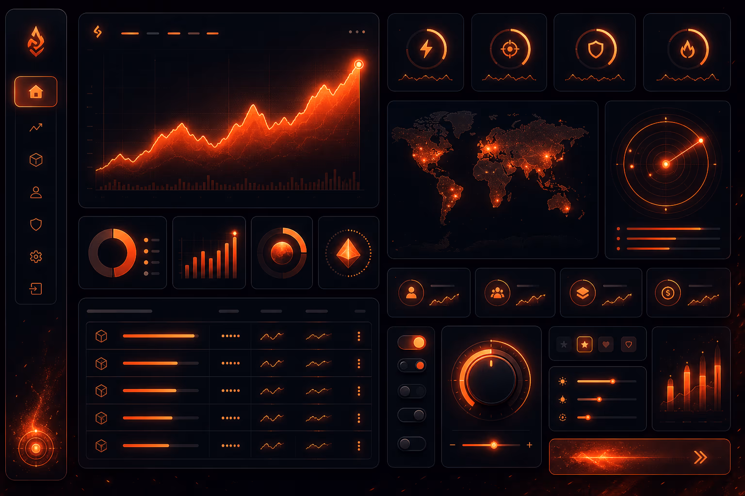
A SaaS dashboard is a complex beast. Users navigate dozens of screens: analytics, settings, user management, billing. Each screen must feel like it belongs to the same product, not a Frankenstein of separate pages. A design system enforces visual and interaction consistency—same buttons, same spacing, same color usage. Without it, users lose trust. With it, development speed actually increases because teams reuse patterns instead of reinventing them.
But consistency alone isn’t the goal. The real metric is how quickly you can ship new features without breaking the visual language. At DigiForge, we’ve seen teams that obsess over pixel-perfect alignment in mockups but then ship a dashboard where every modal has a different close button. A design system bridges that gap. It codifies decisions so neither designers nor engineers have to debate spacing or color on every new screen. That’s where the speed gain comes from—removing decision overhead.
The Speed-Consistency Trade-Off
The common fear is that design systems slow you down initially. True—if you build an exhaustive library before shipping any features. But we’ve found a pragmatic approach: start with the minimum viable system and evolve it alongside the product. Consistency isn’t absolute; it’s about reducing friction, not eliminating all variation. The right trade-off yields net speed gains by the third or fourth feature.
Consider this: a new dashboard screen might take a week to design and build from scratch. With a design system, the same screen might take two days because you’re assembling existing components. Even if you spend two weeks upfront building the system, you break even after three screens. After that, every new screen is a net positive. In our experience, the break-even point comes even faster because the system also reduces QA and rework.
Building a Pragmatic Design System
Start with Design Tokens
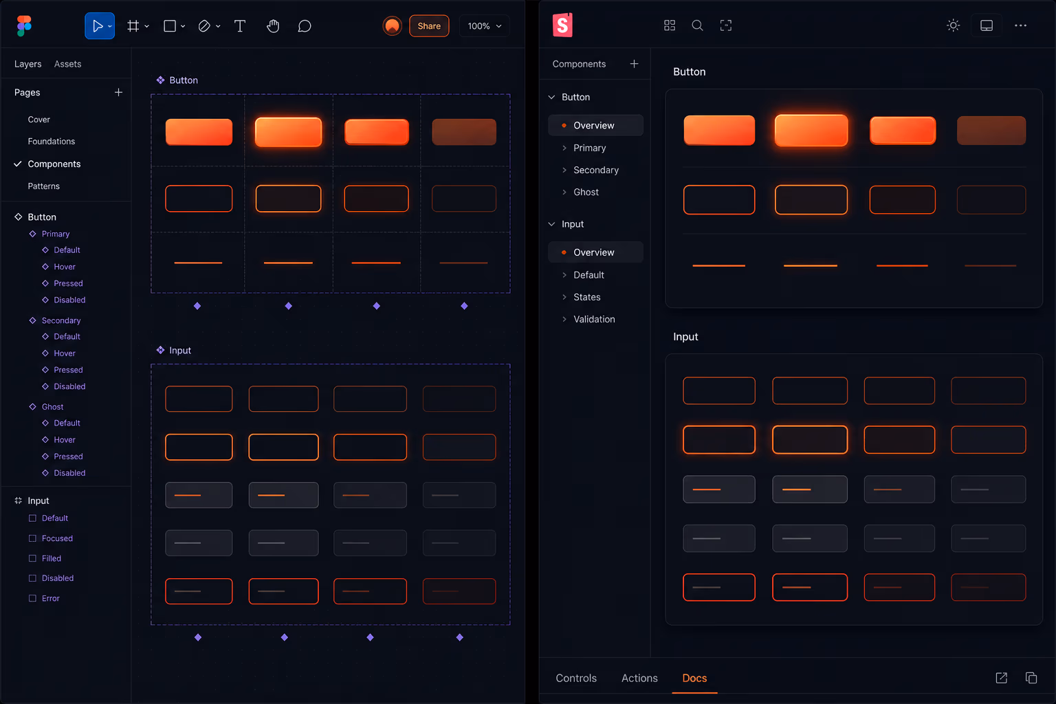
Design tokens are the atomic units—colors, type scales, spacing, shadows. They’re the single source of truth for visual properties. We define tokens in both design tools (like Figma) and code, keeping them synced via tools like Style Dictionary. This ensures a button’s background color in Figma matches exactly what ships. Tokens are lightweight; you can start with a dozen and add more as needed. At DigiForge, we usually begin with core colors (primary, secondary, neutral, error/success), a type scale of four sizes, and a spacing scale based on 4px increments.
Tokens also make theming trivial. If your SaaS offers white-label or dark mode, you can change the token values without touching component logic. We once had a client who wanted to rebrand their dashboard for a sub-product. We replaced a JSON file of tokens, and the entire UI shifted colors overnight. That’s the power of a token-first approach.
Create a Component Library
Components are the building blocks: buttons, inputs, tables, modals, cards, navigation, charts. We build them in Figma as reusable components with variants (e.g., button sizes, states) and then implement them in code as a UI library (React, Vue, or whatever the stack demands). The key is to keep the component count small—only what’s actually used. It’s tempting to design every possible permutation, but that’s where bloat creeps in. We borrow inspiration from Dribbble’s popular dashboard UI shots to see common patterns, but we only adopt what we need.
A component library should be opinionated. If a developer can override a component’s style inline, the system breaks. Instead, expose props for behavior, not appearance. For example, a Button component should accept size, variant, and disabled, but not a style prop that lets them set any color. Use design tokens under the hood. This enforces consistency while still offering flexibility where needed.
Integrate with Development Workflow
A design system that lives only in Figma is useless. Developers need the same components in code, with proper props, documentation, and visual regression tests. Figma’s collaboration features allow designers to share components directly, and plugins can generate code snippets. But the real win is a Storybook-style documentation site where both teams verify consistency. We tie component changes to a lightweight governance process: one designer and one developer approve additions. This prevents the system from becoming a dictatorship or a free-for-all.
Automation is your friend. We use GitHub Actions to automatically build a Storybook site on every PR. Designers can preview component changes in an isolated environment before they touch the dashboard. This feedback loop catches mismatches early. We also run visual regression tests with Percy or Chromatic—if a component change alters a snapshot unintentionally, the PR is flagged. It’s a safety net that lets us move fast without fear.
Common Pitfalls and How to Avoid Them
Over-Engineering the System
The biggest mistake is designing for every edge case before shipping anything. We’ve seen teams spend months on a button component with 15 variants, when only three are ever used. The result? Developers ignore the library and write inline styles. Our rule: design tokens first, then components only when a pattern appears three times. Let the product drive the system, not the other way around.
Another variant of over-engineering is building a full design system for a dashboard that’s still in discovery phase. You don’t know which components you’ll need until you start building screens. That’s why we advocate for a “system as you go” approach. Start with the UI for your first major feature, extract reusable pieces, and formalize them gradually. This keeps the system lean and relevant.
<b>Start small</b>. Define 5–10 tokens and 3–5 components. Build your first dashboard screen with them. Then iterate. A design system is a living product, not a one-time delivery.
Lack of Governance
Without clear ownership, the design system decays. Designers add new colors, developers hardcode values, and soon the system is a mess. We assign a rotating “design system steward” from both design and engineering teams. This person reviews monthly additions, removes unused components, and updates documentation. Governance doesn’t mean bureaucracy—it means a lightweight process that keeps the system healthy.
Part of governance is a clear process for proposing changes. We use a simple RFC template: what is the change, why is it needed, what components/tokens does it affect, and what’s the migration path? This document is reviewed by the stewards and then merged into the system. If a change is rejected, the team documents the reason. This transparency prevents resentment and keeps the system coherent.
Ignoring Developer Input
Design systems often fail because developers weren’t consulted on feasibility. A component that looks perfect in Figma might be a nightmare to implement responsively. We run weekly syncs where designers show new components and engineers flag practical concerns. Tools like Canva and Microsoft Designer are great for rapid prototyping, but production code has constraints. Bridge the gap early.
Also consider performance. A dashboard may have dozens of data-heavy components. If a design calls for complex shadows or gradients on every card, the render cost adds up. Developers should have a seat at the table to discuss performance budgets, accessible color contrast, and keyboard navigation. A design system that ignores these will be either ignored or rewritten.
Real-World Example from DigiForge
We recently built an analytics dashboard for a B2B SaaS client. The team had six months to ship a full product. Instead of building a perfect design system upfront, we created a token library (16 tokens) and five core components: Button, Input, Table, Card, and Modal. We used Figma’s component properties to handle variants. As we built screens, we added components only when needed—like a DatePicker for the reporting module. The result? The first screen took two weeks; subsequent screens took one to two days each. The design system grew organically and never blocked development.
One unexpected benefit: the client’s marketing team used the token values in Canva to create landing pages that matched the dashboard look. They exported color hex codes from our token documentation and applied them to their designs. That alignment meant the product site and the app felt like a single brand, which improved user trust. A design system isn’t just for the app—it becomes the brand’s visual language.
Tools That Support Your Design System
Several tools make design system maintenance easier:
- <b>Figma</b>: The industry standard for collaborative design. Its component system, styles, and variant management are built for design systems. See Figma.
- <b>Design.com</b>: While primarily for brand identity, it can generate logos and color palettes that feed into your token library. Explore Design.com.
- <b>Dribbble</b>: A great source of inspiration for dashboard UI patterns. But never copy—adapt to your system. Browse Dribbble.
- <b>Canva</b> and <b>Microsoft Designer</b>: Useful for rapid mockups and marketing collateral, but not for production-grade component systems.
Choose tools that integrate with your workflow. At DigiForge, Figma is our design hub, but we connect it to code via automated tokens export. The toolchain matters, but the underlying discipline of consistency is what drives speed.
Measuring the Success of Your Design System
How do you know if your design system is working? We track a few metrics: time to ship a new screen, number of consistency violations (e.g., a developer using a hardcoded color), and system adoption rate (what percentage of UI components come from the library). We also survey the team every quarter. If designers feel constrained or developers feel the system is incomplete, we adjust.
A less obvious metric is the number of bugs related to styling. When teams use a design system, spacing and alignment bugs decrease significantly. In one project, we saw a 40% reduction in UI-related tickets after adopting a token-based system. That’s time saved for the entire team.
Evolving the System Without Breaking the Dashboard
Design systems must evolve. As your SaaS adds features, you’ll need new components and patterns. The danger is making breaking changes that force a rewrite of every screen. We avoid this by versioning our design system. In code, we publish the component library as an npm package with semver. Deprecated components emit warnings but still work. In Figma, we use library branches to test new components before pushing them to the main library.
Communication is critical. When we update a token value, we announce it in Slack and update the documentation. If the change is visual (e.g., a new primary color), we coordinate with the product team to roll it out across screens in a phased manner. This prevents surprises and builds trust in the system.
Conclusion
Design systems for SaaS dashboards don’t have to be slow. Start lean, iterate based on real usage, involve developers early, and maintain light governance. The result is a consistent UI that ships fast—and a team that trusts the system. If you’re planning a new dashboard or refactoring an existing one, we’d love to help. Contact DigiForge to discuss your design system needs.